FUN STUFF
What's with the love for the art department, you may ask?
First off, let me explain... A television series art department is the talent group of psychos who bring the world of Smallville alive. They create all the signs that adorn the storefronts of Cloverdale and Merritt British Columbia and transform it into the fiction town of Smallville, Kansas, and produce the copies of the Torch, Daily Planet, and Metropolis Inquisitor that the characters read, or web sites they load up on their computers.
They're graphics freaks, just like you and me. And frankly, they entertain the heck out of me.
Here's why...
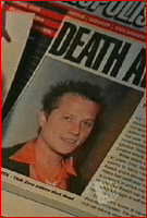
| The Inquisitor page Clark printed off from their website, featuring a story on Jude Royce's death actually featured a photo of actor Corin Nemec from Glamour Magazine's 2000 "Don't" Party (photo by Jeff Vespa) from Nemec's IMDB entry. | |
 |
 |
| From the font to the colours to the layout, the Metropolis Inquisitor is modelled directly after the real-world New York Post. Gee, the Inquisitor is spoken of as a worthless tabloid rag. Golly! | |
 |
 |
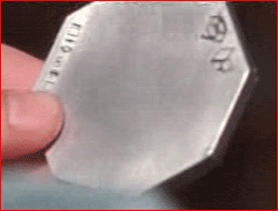
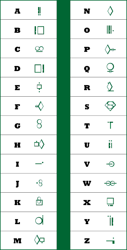
| The markings on the key found by Dr. Hamilton come from the Kryptonian alphabet designed by writer/wrtist John Byrne and letterer John Constanza in the late 1980s for the re-launch of the Superman titles following the events of Crisis On Infinite Earths. | |
 |
|
| The alphabet can be seen in this English/Kryptonian Transliteration Guide which was included in the packaging of the 1999 DC Comics Green Kryptonite prop. The symbols are also available as macintosh and true-type fonts designed by Supermanhomepage.com maintainers Michael Lee and Steve Younis. | |
 |
|